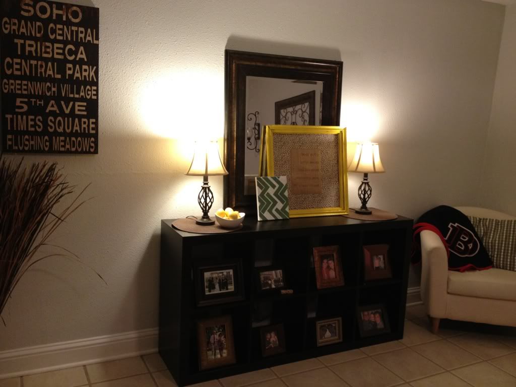
Two more weeks and I am out for summer. I am s-o ready. My kindergarteners had their first reading at Mass this past Thursday (which is a big deal at our school: next year, all the way to 8th grade, they will alternate throughout the year and do it about four times... however, Kinder only does it once at the end of the year, and it shows off how well they can read, etc. Lots of parents came and it was fun!) and I am glad it is over though! Now onto the fun, end-of-the-year activities.
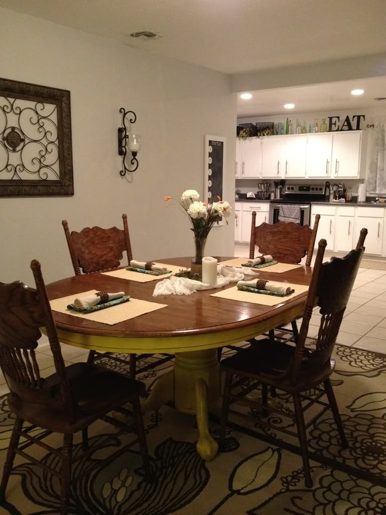
Anyhoo, the reason of this post: dining room. UGGHHH if any room had to be a thorn in our side, it would be this one. It's really big and awkwardly laid out. There are also no windows in this room (the closest windows are in the kitchen), so it gets really dark. Here are some photos of it now:
The left side: You can't tell in this photo, but there is a beam to my left (like where I would be standing when I took the photo) and above my head is another beam... so it's like this room was sectioned off to be another room, but it has no walls...? Weird. Moving on.
Right side, leading into the kitchen (this photo was taken before we added our pop of color green as a back-splash). I feel that our now-yellow table competes with the patterned rug, so I want to get a more neutral (maybe jute?) rug underneath. We took the wrought iron art off the back wall as well as the sconces. Both are moving into our master bedroom.
Maybe this better explains the beams and two rooms in one that I was trying to explain earlier (these were taken when we went to view the house, long before we owned it)!
See? Awkwardly placed beam (that is obviously load bearing and can't be removed) and the ceiling beam that splits the room UNEVENLY in half? AND the lighting is also terrible and not centered. What...
So... We want to make some changes.
Here is what we want to do to that long wall (where we removed the wall art and sconces):
Some sort of gallery/framed shelving. We purchased some shelving at Ikea already, but the wall is super long and we already need more to make it look balanced.
We are still baffled by what to do with the left section? Sitting area? Reading nook? Nate wants a pool table (psh) but it isn't that big of a space (aw shucks). Any ideas for an awkward space?


Ooh that will look SO good on the wall! I love the idea of a cozy reading nook....especially since I know you enjoy reading :)
ReplyDeletei love all the frames idea! and I vote for a reading nook! : ) yeah for 2 more weeks - I have three and am SO ready for summer!!
ReplyDeletei love your ideas, that is going to look incredible! i am so exciting to see this!
ReplyDeleteand i think a reading nook would be perfect since you love to read!
and i know all about awkward spaces ... i have them all over my house but unfortunately for me, i am not as crafty or as creative as you :/