The theme of our kitchen is "white and bright": although there isn't MUCH natural light (and I took these pictures at night, hmph), the canned lights in the ceiling give off PLENTY of light! Everything is white, black/gray/charcoal, or stainless. Pops of yellow, blue, green, and wood tones. We hope to add an island one day as well!
We haven't had to do much since we moved in almost two years ago: our seller was a house-flipper, as in she renovated the house completely from the ground up. She did a GREAT job and although we will change a few things down the road, it looks pretty sweet for now! We painted some of the walls a light grey color and added the stainless steel fixtures on the cabinets. We also purchased the stove and refrigerator.
Hereee's our kitchen!
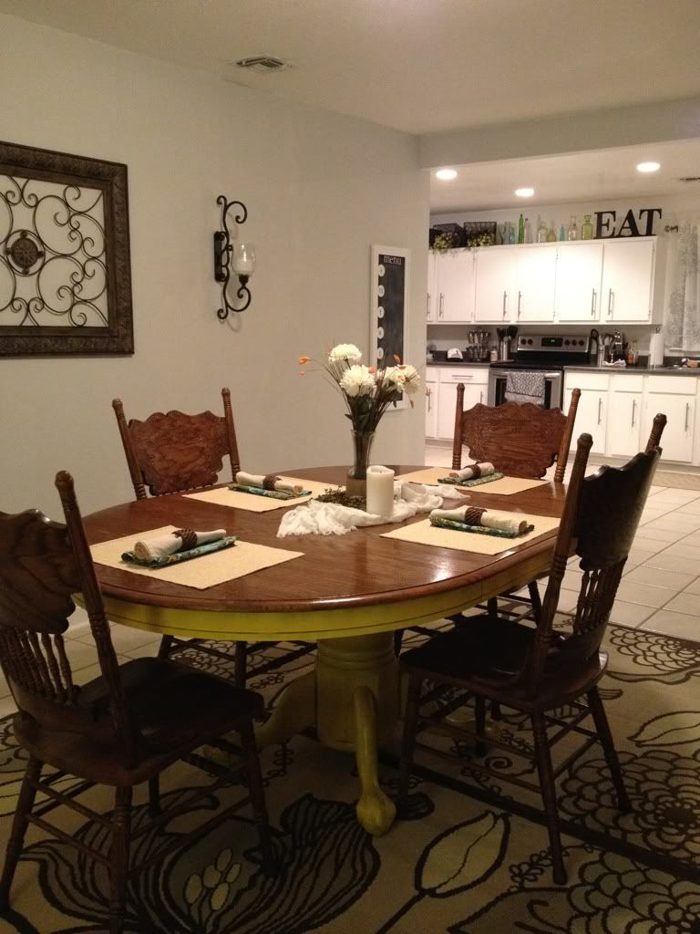
The dining room leads into the kitchen. Yes, I will now share that we painted the base of our table YELLOW. Agh, I'm still getting used to it! I want to change the rug to a neutral, that way the accessories on the table will pop. Not sure yet though!
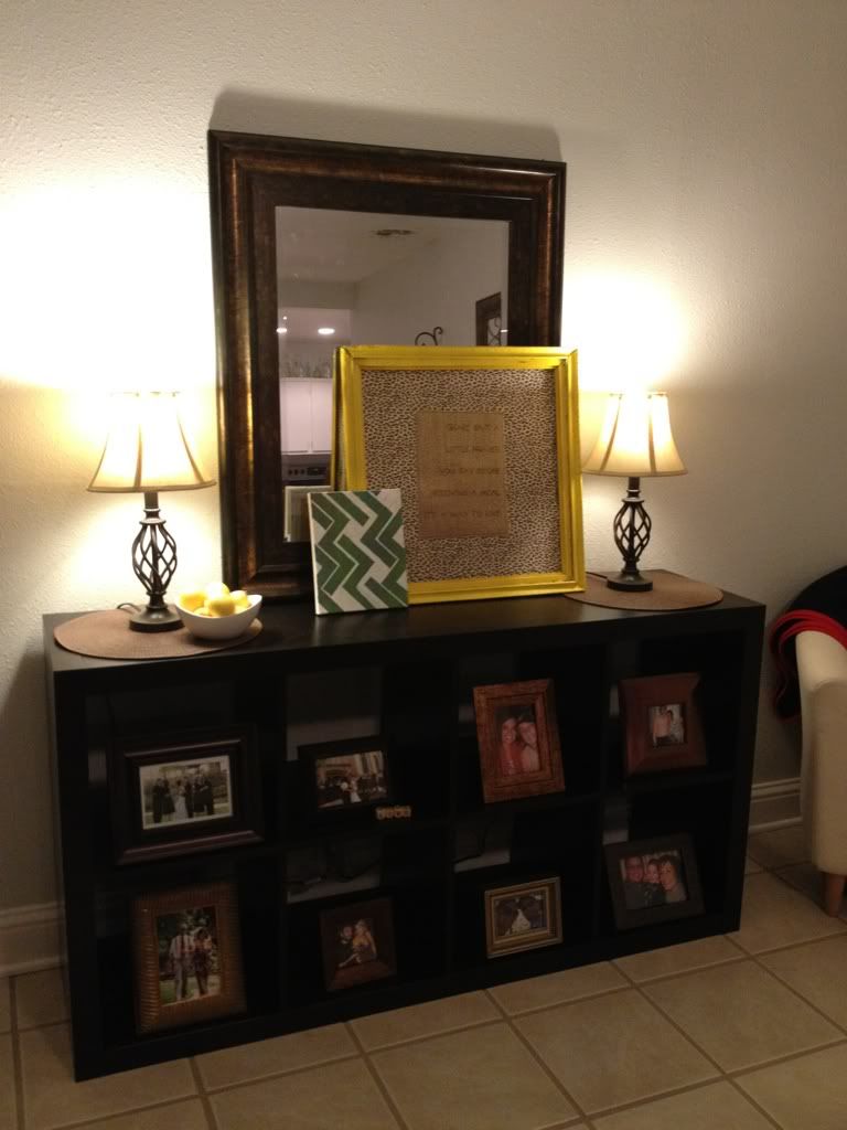
Little buffet thang we got at Ikea a couple of years ago. Eventually, it
will have baskets to hold my china, seasonal dishes, etc since that
storage is cray-cray right now (you'll see in a bit). You can see where I
printed on burlap and did my own mini-artwork.
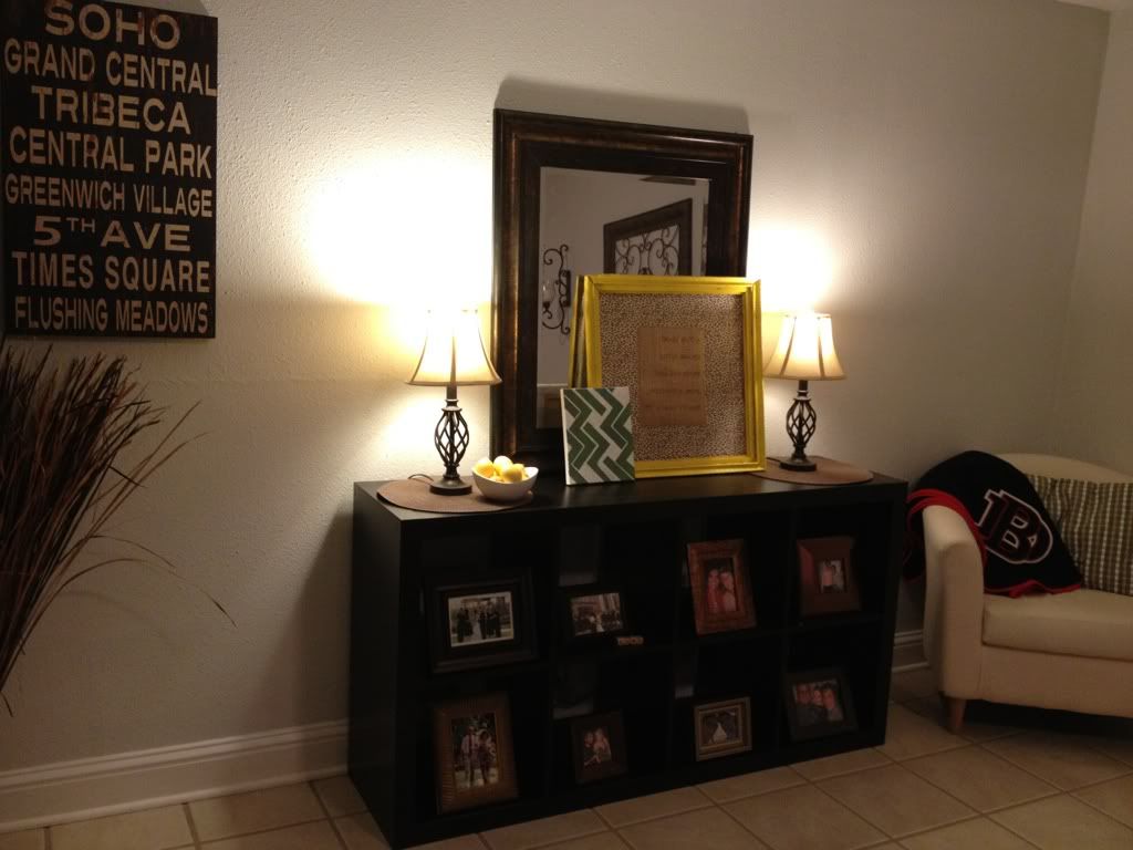
Another view.
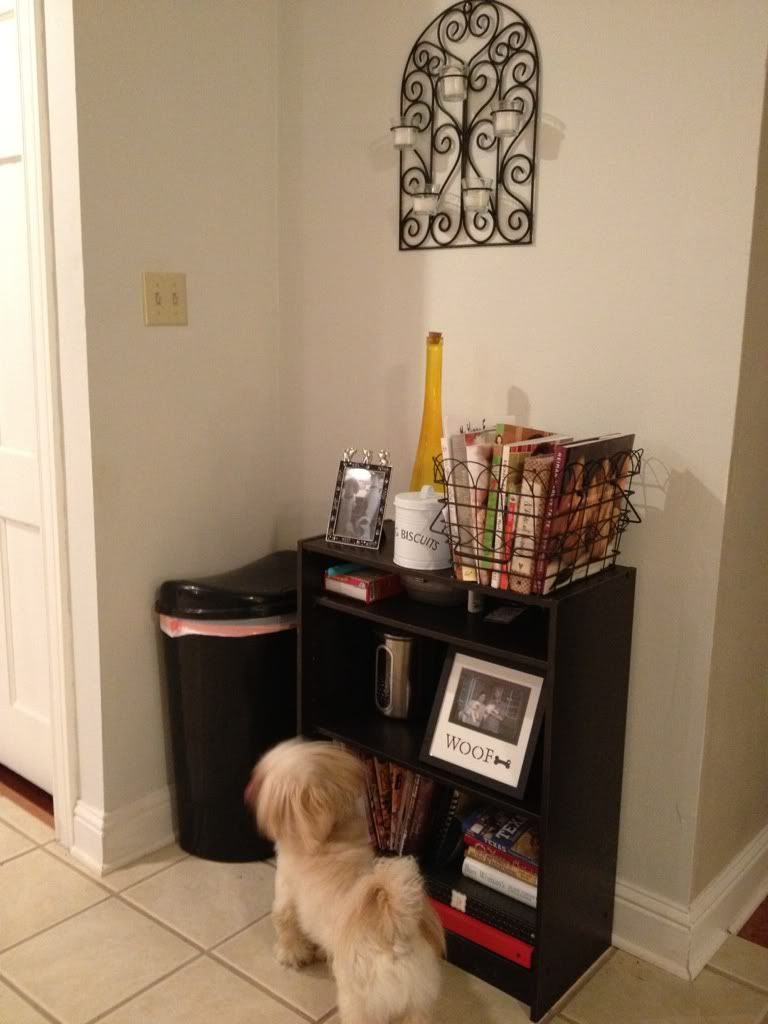
Puppy central. Pictures of the pups, their treats, meds, other needs. We
also have our recipe/cook books over here... They don't get used often!
And also the trash... not too exciting, people!
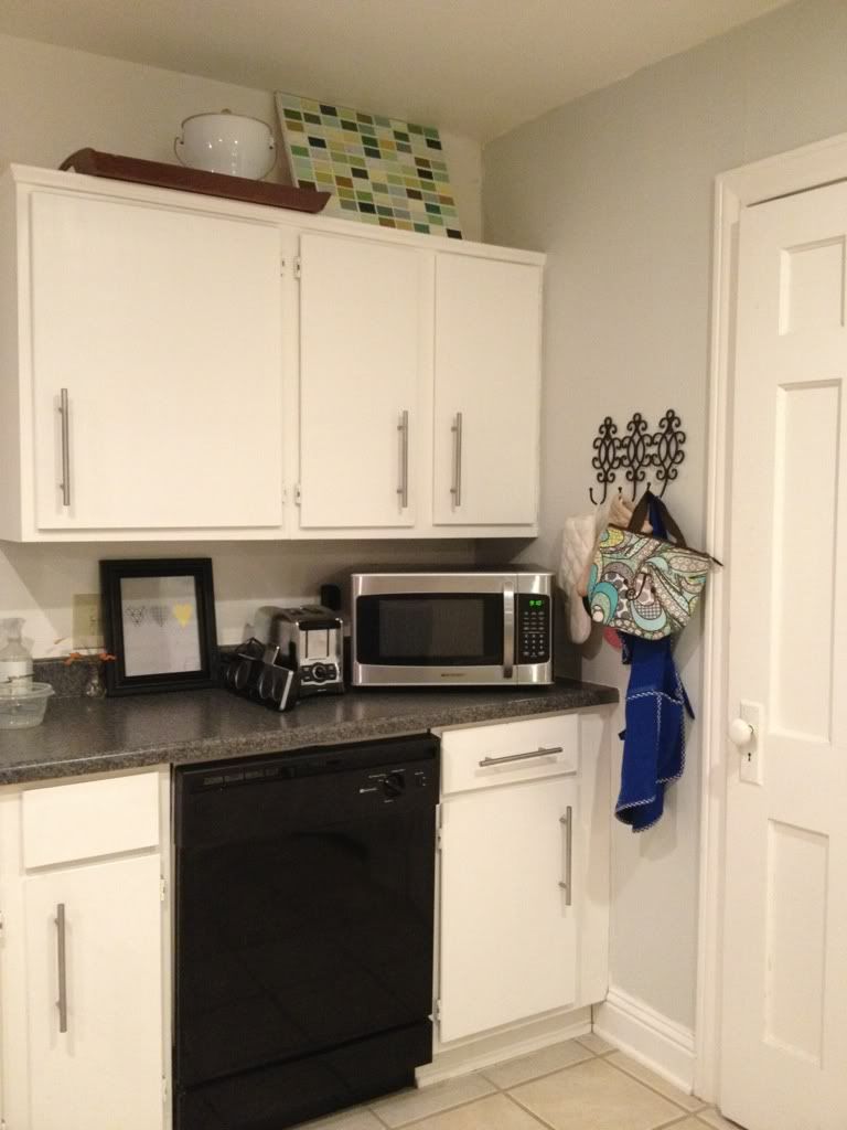
Pantry is to the right, our microwave is at an angle, and our oven
mitts/my lunch bag (for school) are hanging on hooks from Hob Lob. I did
DIY artwork that's at the top (made out of paint sample cards and a
canvas). There is also a printable in a frame from Less Cake More Frosting, I think from a year ago? The toaster stays out, as well as our portable iHome: my hub listens to sports radio while he does the dishes. Aren't I lucky? :) He's so good to me!
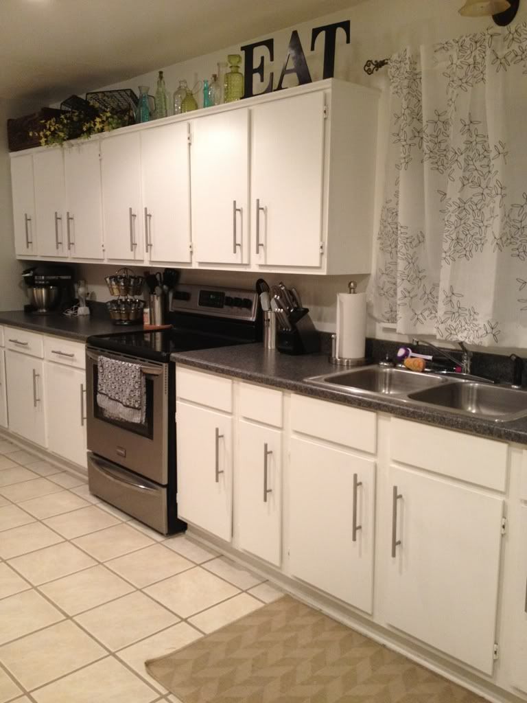
View of the longgg cabinet/counter space. The curtains above the sink
(which are eventually going to g-o) and the rug are from Ikea. I did an
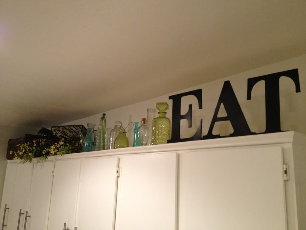
EAT sign at the top of my cabinets like many of you have (just spray painted wooden letters from Hob Lob)! I also have an
assortment of glass bottles at the top. I hope to have the cabinets
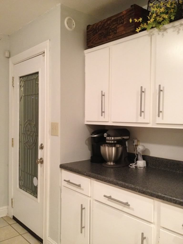
filled with these one day! The Keurig, Kitchenaid mixer, and can opener stay out on the counter. The glass door in the second photo leads out to our backyard.
Another view.
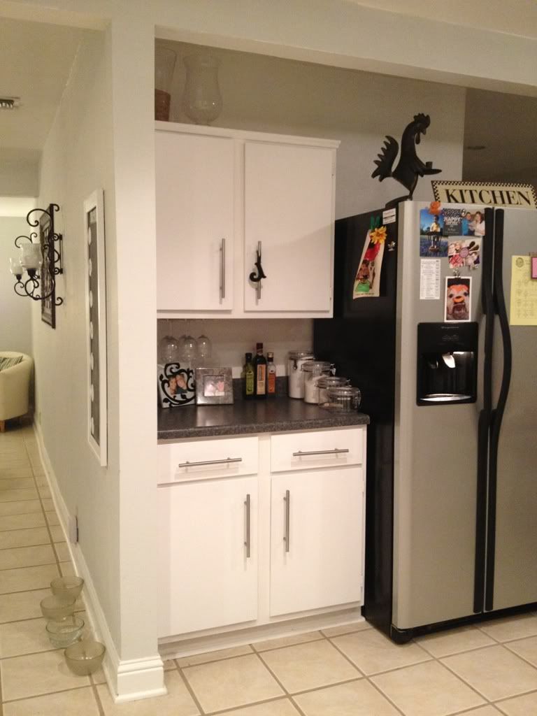
Other side of the kitchen, by the dining room, is where the refrigerator
is and where my china/seasonal dishes are stored on top. Napkins and
place mats are in the drawers. Also, small appliances like blenders and
food processors and miscellaneous pans are stored in the bottom
cabinets.
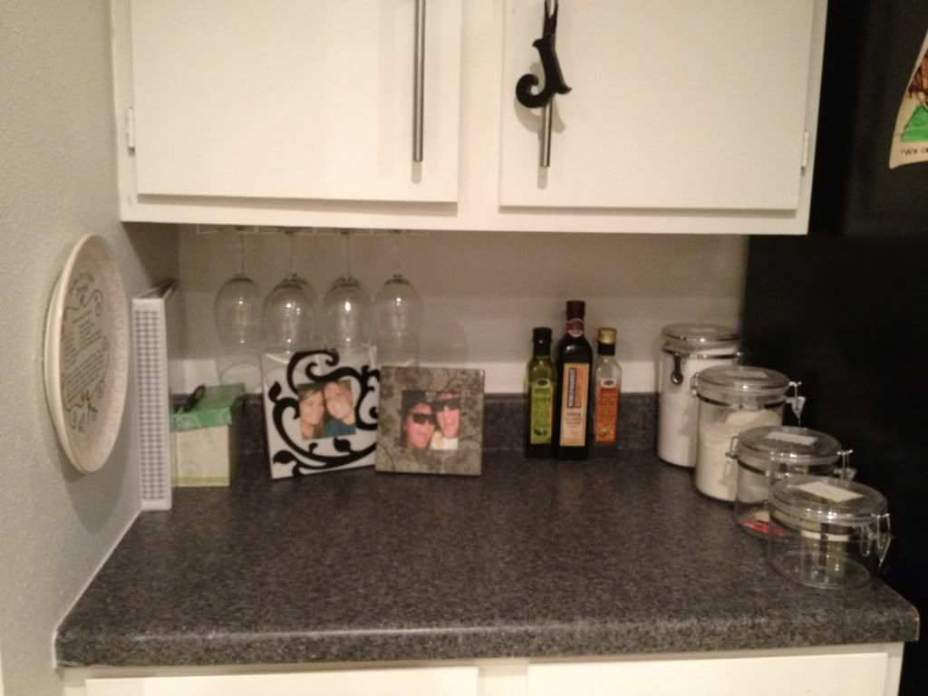
Another view.
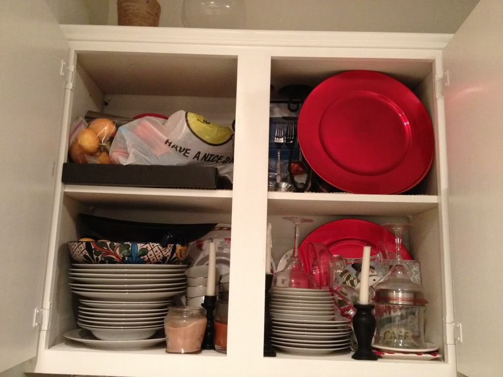
Agh! I'm a fraud. Look at this storage... cray cray! Pretty much just
stuffed up there... but just trying to keep it real on the blog!
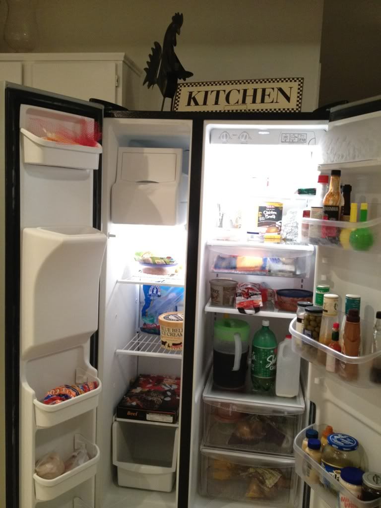
In appropriate style (during most home tours), I can show you what's in
our refrigerator (or lack there of! grocery shopping day is scheduled
for tomorrow!)
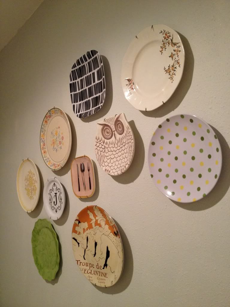
When you turn the corner by the refrigerator, you can see the beginnings of my plate wall! It will be done... someday...
So that's my kitchen: now share yours!


i love it! i really like the bookshelf/unit with the yellow frame on it - so cute!
ReplyDeleteI absolutely love your kitchen!!! I just love white cabinets!! I wish I were brave enough to paint our cabinets.
ReplyDelete